Registered customers
Log in if you have an account
Green, but make it magic!
Green is one of those colours that feels like a breath of fresh air inside your home. Calming, energising, grounding… it all depends on the shade you choose and what you combine it with. Here are five of my favourite green pairings to help you create interiors that feel balanced, warm and personal.
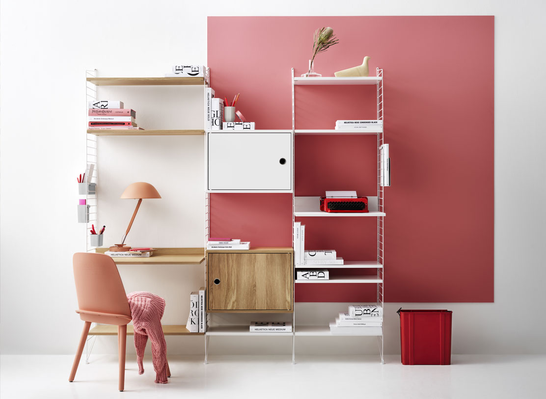
Evergreen and soft pastels: fresh and uplifting
Think evergreen with lemon-yellow and pale neutrals. This combo is perfect for workspaces or creative corners. Evregreen brings calm, yellow brings joy, and white metal details keep everything light and crisp. It is a quiet boost of energy without the caffeine.
→ Shade colour: Evergreen ES18
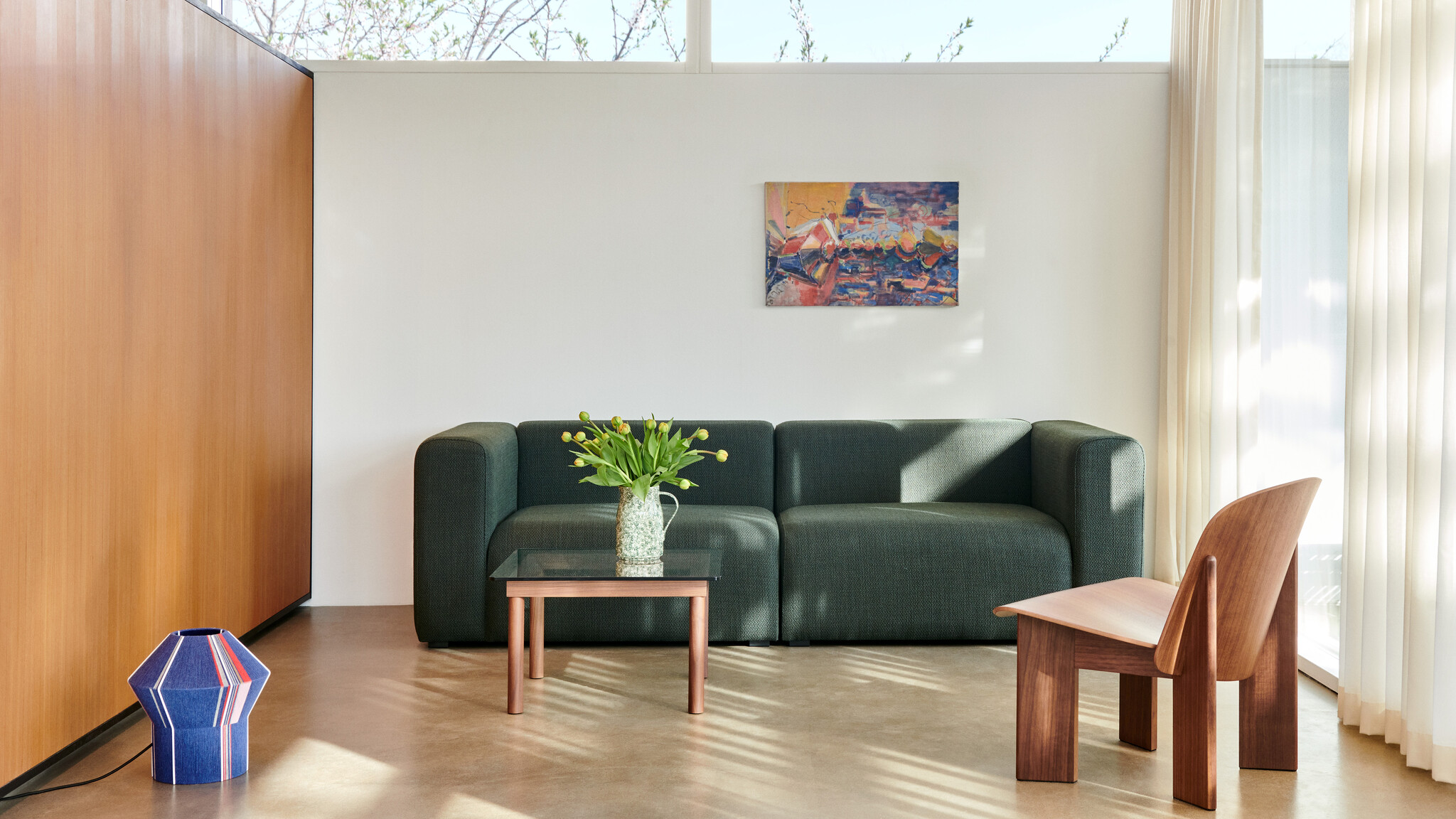
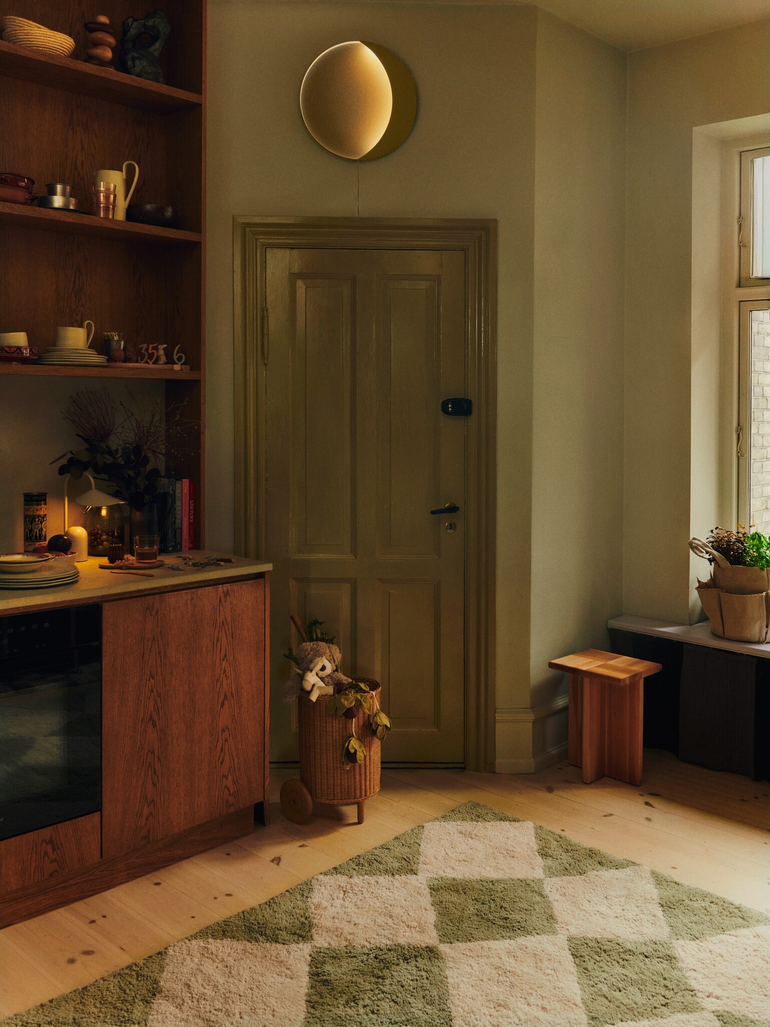
Deep green and warm wood: a forever classic
If you want instant sophistication, this is the one. A dark green next to walnut wood instantly feels grown-up, warm and comforting. Add some glass to the mix for a soft contrast. This pairing works in any space where you want calm and quiet confidence.
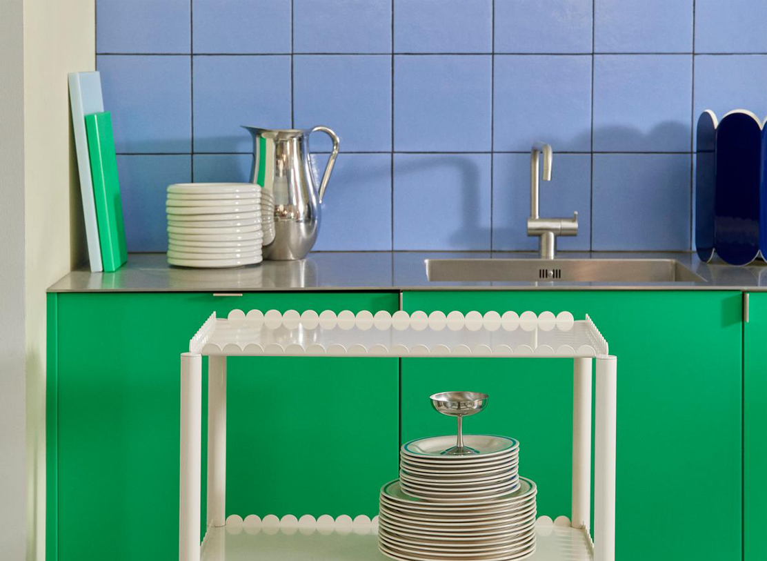
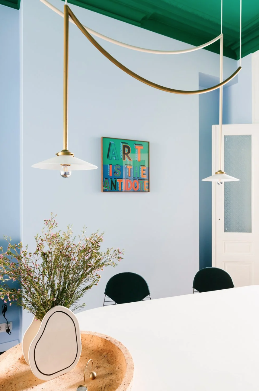
Green and sky blue: unexpected, fresh and full of life
A bold green ceiling with baby blue walls? Yes please. This duo looks playful and airy at the same time. Perfect for kitchens or dining spaces that need a little spark. Add brass or cream lighting to warm it up and you get a space that feels both fun and elegant.
→ Shade colour: In the Woods KC16 and Surfers Blue KC13
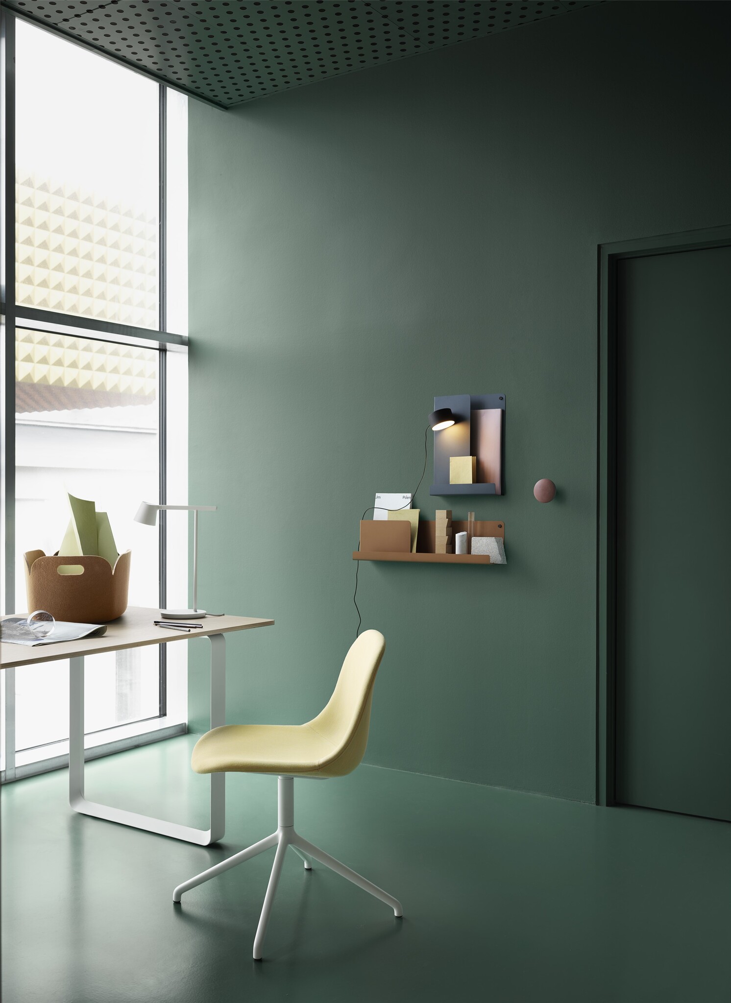
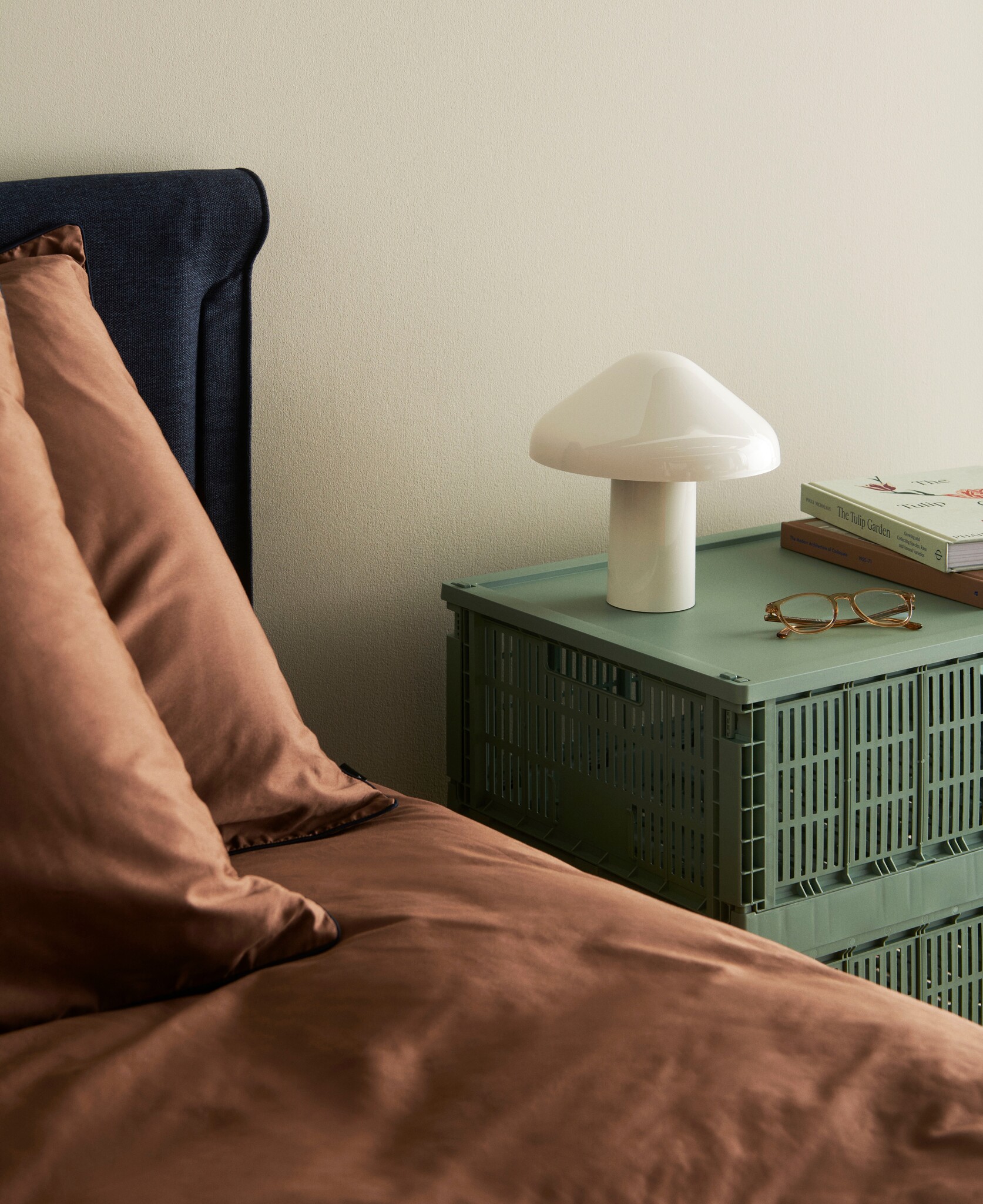
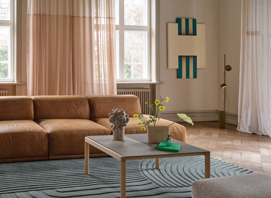
Green and earthy tones: cosy and grounded
Sage green paired with warm earthy colours like terracotta, caramel or deep chocolate wraps a room in instant comfort. It is the palette that makes you exhale. Think soft textures, dim lighting and colours that feel like a warm blanket. Perfect for bedrooms, reading nooks or any corner where you want to slow down and settle in.
→ Shade colour: Silver Sage ES21 and Hot Rosé ES27
Green and pastel pink: sweet but modern
Mint green paired with dusty pink creates a soft, charming palette that feels calm but never boring. Add a few deeper green accents to ground the space, then sprinkle in bold blue accessories if you want a playful twist. It is the perfect mix for anyone who loves gentle colours with a fresh, modern bite.
→ Shade colour: Avocado toast KC15, Pistacchio ES20, Pink Glow ES29

A little styling secret
Green connects spaces. It is soothing without being boring, colourful without being loud. It works with wood, metal, ceramics, textiles and almost every paint colour in our SHADE palette. It is the colour of balance, freshness, growth and good energy, exactly the feeling I want every home to have.
Ready to play with colour but not sure where to start?
Let’s create your perfect palette together.
→ Try Colour Advice
Recent stories
View all
How to create a gallery wall with personality
How to style your coffee & side table without clutter